The New Omega
November 13, 2014
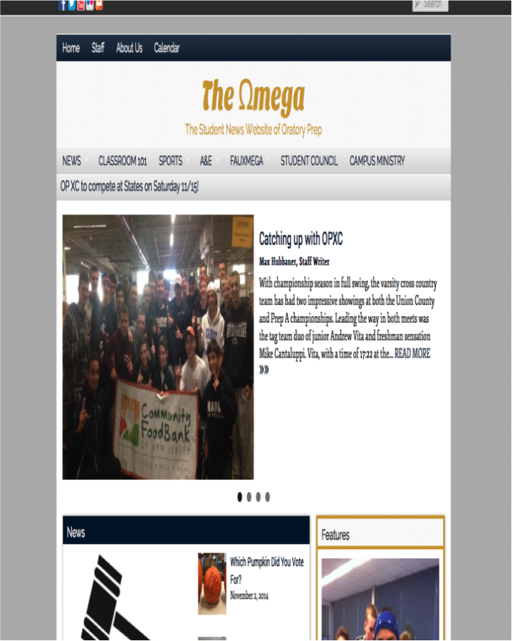
The Oratory Prep Omega has already undergone two major design changes within two school months, with one implemented in September and the second in October. In the September design change, the blue and gold background was replaced by a simple white background with an interactive interface. However, the radically new website design received sharp criticism for its non traditional color scheme and abstract layout, and as a result the website was temporarily unavailable due to an emergency design change. The current design was revealed in October with an updated look from the original Omega. The new website has more than ten interactive features, ranging from news and features to polls and archives, which are all complemented by sharp and relevant images. My personal favorite feature is the news ticker located directly under the news links. The website also has five social media links at the very top of every page, which are intended to digitally promote the Omega in as many ways as possible. The “New Omega”, as it has been christened, has been very well received by both students and the faculty, and it now supports the largest number of contributors in Oratory history with an exponential amount of publications produced monthly. With the introduction of the New Omega, the student news “website” of Oratory Prep has been transformed into the student news “community” of Oratory Prep and will continue to grow and prosper, just like Oratory Prep itself.
