An Open Letter (and Review) of the New Google Classroom
September 21, 2018
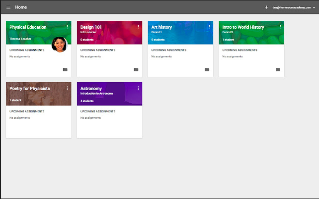
Like many students across America, and indeed the world, I was surprised by the sudden update to the version of Google Classroom. Don’t get me wrong, I have found Google Classroom to be a vast upgrade to the slew of emails that I used to send in assignments or do threaded discussions in 7th and 8th grade, but the new update left a lot to be desired.
OP students have described the new classroom as “more complicated than it needs to be”, and that is very true. The new classwork tab, while well intended, could use a bit of improvement. It is harder to know when work is due because it no longer shows up on the assignment when it is posted on the homepage. Instead, just clicking redirects us to the classwork tab, where assignments are posted by topic, not due date. Now, the classwork tab does provide the benefit of posting resources directly to the stream, something that had to be accomplished through the about section of the old version. However, the benefits of that are directly outweighed by the fact that we can no longer view our assignments from the home page.
Overall, it’s a good start. But Google Classroom needs to be redesigned with the idea of making sure it is easy to use for students, not just coded fancily.
Photo Credits to Google
